
The Complete 2026 Developer’s Guide to Image Optimization: Formats, LCP, and Mobile Speed
This is my personal experience.
I am a website developer, and when I created my website, I faced a major issue related to image loading. Images were taking too long to load on my website, which was badly affecting the overall speed and user experience. My website should normally load in around 2 seconds, but due to image issues, it was becoming very slow.
After researching and consulting experts, I found a tool that helped me understand this problem clearly. The tool is called Image Load Time Calculator. It helped me analyze how image size affects loading speed and how long an image takes to load across different networks.
This tool also showed results based on different network speeds, such as 2G, 3G, 4G, 5G, and even high-speed connections like Starlink. It helped me understand how optimizing image size can improve website performance.
After using this tool, I was able to reduce image size, improve loading speed, and make my website much faster and more efficient. It also helped me test images before uploading them so I could avoid performance issues.
If anyone is facing similar problems with website speed or images, this tool can be very helpful for testing and better understanding loading times.
If there is one thing I have learned from years of building WordPress sites and optimizing them for search engines, it’s this: heavy images are the silent killers of good websites. You can have the most brilliant content and the cleanest code, but if a user has to stare at a blank screen for four seconds waiting for a banner to load, they will leave. And Google will notice.
When SEO and development merge, we stop looking at images just as “pictures” and start looking at them as data payloads. Today, I want to walk you through exactly how to handle images in 2026. We are going to cover the best formats, how to fix your Core Web Vitals, and how to make sure your mobile users aren’t left behind.

Part 1: WebP vs. AVIF vs. JPEG: Which is Best for 2026?
Choosing the right image format is the easiest way to cut your page weight in half without writing a single line of complex logic.
For years, JPEG and PNG were the standard. They’re outdated now. Image compression generally falls into two categories: lossless (keeps every detail, like PNG, at the cost of large files) and lossy (trims some data to save space, like JPEG).
- WebP — the current industry standard, offering strong lossy and lossless compression compared to JPEG and PNG, with support well above 95% of browsers globally. If you’re not using it yet, you’re actively hurting your site’s speed.
- AVIF — the more advanced option, often producing files 30–50% smaller than JPEG at equivalent visual quality. Browser support now sits comfortably above 90%. The trade-off: AVIF takes longer to decode than WebP, which can slightly affect INP on older or lower-end devices, so it’s best reserved for hero images rather than every image on the page.
Recommended encoding targets: WebP around 75–85 quality, and AVIF around 60–70 quality, both typically look visually identical to JPEG at 90+ while being significantly smaller.
Developer tip: if you’re bulk-compressing images and need to visualize the byte-level difference across formats, our Data Storage Converter makes it easy to map out the exact savings.

Part 2: Core Web Vitals Deep Dive (Fixing LCP)
Fixing LCP
If your LCP is over 2.5 seconds, you’re losing rankings. Here’s the workflow that actually moves this number:
- Reduce render-blocking resources. Heavy CSS and JavaScript block images from displaying. Minify your scripts and push non-essential JavaScript to the footer so visual content can load first.
- Prioritize the right image — and only that one. Use
fetchpriority="high"on your main hero image so the browser downloads it before less important resources. Important: apply this to exactly one image per page. Marking every image as high priority defeats the purpose, since the browser has nothing left to deprioritize. - Preload your hero image. Add
<link rel="preload" as="image" href="your-image.webp">to your document head so the download starts before the HTML is even fully parsed. - Serve the right format with a clean fallback chain. The
<picture>element lets the browser choose the best format it supports:
html
<picture>
  <source srcset="hero.avif" type="image/avif">
  <source srcset="hero.webp" type="image/webp">
  <img src="hero.jpg" alt="Descriptive alt text" width="1200" height="630" fetchpriority="high">
</picture>
The browser tries AVIF first, falls back to WebP, and uses JPEG as a last resort — giving every visitor the smallest file their browser can handle.
Fixing CLS
CLS gets far less attention than LCP, but it’s just as measurable and just as damaging when ignored. The fix is simple and has no real trade-off: always set explicit width and height attributes (or aspect-ratio in CSS) on every image. This lets the browser reserve the correct space before the image finishes loading, so nothing jumps around as the page renders. Skipping this single attribute pair is one of the most common — and easiest to fix — image-related CLS failures.
Watching INP
INP is the metric most sites currently ignore when it comes to images, but the connection is real. Decoding a large or complex image (AVIF especially) takes main-thread time, and on lower-end devices, that decode work can briefly delay how quickly the page responds to a tap or click. Two practical fixes: add decoding="async" to your image tags so decoding doesn’t block rendering, and avoid AVIF for large galleries of simultaneously-loading images where WebP’s faster decode time is the safer default.
Test your current hero image directly with our free Image Load Time Calculator — it tells you instantly if your LCP is in the danger zone across different network conditions.

Part 3: Optimizing Images for Slow 3G/4G Networks
Not everyone browses your site on a fast fiber connection. If you want genuine global reach, mobile-first image delivery isn’t optional.
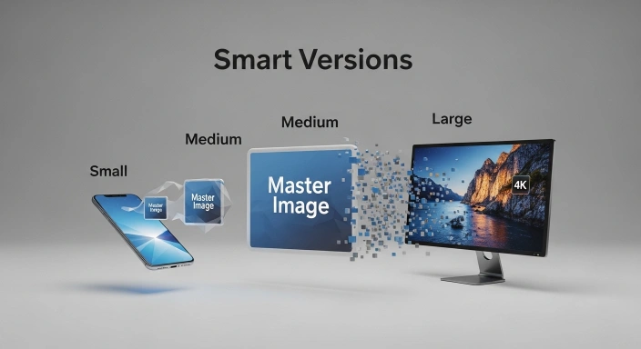
You can’t serve a 2000px desktop image to someone on a smartphone over a slow 3G connection — it eats their data and kills the experience. The fix is responsive images using the srcset attribute:
html
<img src="small.webp" srcset="small.webp 480w, medium.webp 800w, large.webp 1200w" alt="Optimized example" width="800" height="600">The browser checks the user’s screen size and downloads the most appropriate file — a mobile user gets the 480px version, a desktop user gets the 1200px version. You save bandwidth, and the page stays fast for everyone.
Use our Image Load Time Calculator to simulate exactly how a user on a 3G mobile connection experiences your current images, using built-in network profiles for real-world latency.
The 2026 Image Format Comparison
| Format | Compression Type | File Size Reduction | Browser Support | Best Use Case |
| JPEG | Lossy | Baseline | 100% | Legacy fallback only. |
| PNG | Lossless | Very Heavy | 100% | Only when strict transparency with no quality loss is required. |
| WebP | Lossy & Lossless | ~30% smaller than JPEG | 99%+ | Standard web images, blog thumbnails, and general UI. |
| AVIF | Advanced Lossy | ~50% smaller than JPEG | 90%+ | High-end visual sites, heavy hero banners, and strict LCP optimization. |
Mobile Network Optimization Matrix
| Network Profile | Average Bandwidth | Maximum Ideal Payload | Developer Strategy |
| Slow 3G | 400 Kbps | Under 50 KB | Aggressive AVIF compression + strict Lazy Loading. |
| Fast 4G | 8 Mbps | Under 150 KB | WebP format + srcset for viewport-specific sizing. |
| 5G / Fiber | 100+ Mbps | Under 400 KB | High-res WebP with fetchpriority="high" for instant rendering. |
Frequently Asked Questions (FAQs)
Q: Which is better for SEO in 2026, WebP or AVIF?
A: AVIF offers superior compression and smaller payloads for faster loading, but WebP has slightly better legacy browser support. For top SEO rankings, serve AVIF dynamically with a WebP fallback.
Q: Why is my LCP still slow even after I compressed my hero image?
A: Your image might be small, but if it is blocked by render-blocking CSS/JavaScript or lacks the fetchpriority="high" HTML attribute, the browser will delay painting it on the screen.
Q: Do I still need a CDN if I use the srcset attribute for mobile?
A: Yes. The srcset attribute ensures the browser requests the correct file size, but a CDN ensures that the data travels the shortest physical distance to the user, eliminating server latency.
Q: Does lossy compression ruin the visual quality of my website images?
A: Modern lossy formats like WebP and AVIF remove algorithmic data the human eye cannot perceive. At standard 80% compression, the file size drops dramatically while the visual integrity remains perfect.
Q: How do I test if my images are loading fast enough on mobile networks?
A: Instead of guessing, use a dedicated Website Image Performance Audit Tool to simulate specific network speeds (like 3G or 4G) and calculate the exact render time in seconds.
Beyond Images: The Complete Digital Ecosystem
Fixing your images is a massive step toward SEO dominance, but as developers and digital marketers, we know that speed and accuracy must apply to everything we do online.
At GetCalcBase, we don’t just build developer tools. We apply this exact same logic—high precision, instant load times, and zero privacy risks—across our entire platform.
For instance, if you are running paid campaigns, a fast site is crucial, but so is tracking your budget. You can easily plan your ad profitability using the utilities in our digital marketing tools hub, specifically the Affiliate Marketing ROI Calculator 2026.
If you create multimedia content like YouTube videos or podcasts to go along with your fast-loading blogs, you can accurately plan your scripts with our Words to Minutes Speech converter.
This philosophy of clean, fast, and accessible logic extends everywhere. We ensure that students relying on our education tools or professionals calculating complex taxes in our finance tools never have to wait for a sluggish page to load.
The Bottom Line Treat your images with respect. Compress them, prioritize them, and serve them smartly. By combining the right formats (WebP/AVIF), fixing your LCP, and respecting mobile users, you build a website that both Google and your readers will love.