
Responsive Website Checker: Preview Your Site on 150+ Real Devices
Resizing your browser window to “check mobile” gives you a rough rectangle — not what your site actually looks like inside a real iPhone notch, a Galaxy’s edge-to-edge screen, or a folded tablet display. A responsive website checker built around real device frames shows you something much closer to what an actual visitor sees, brand by brand, model by model.
Quick Answer: What Does This Responsive Website Checker Do?
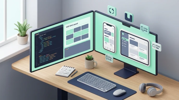
This tool loads any website inside realistic device frames — iPhones, Samsung Galaxy phones, Google Pixels, OnePlus, Motorola, laptops, and monitors — using each device’s actual screen resolution. You can search across 150+ specific models, rotate between portrait and landscape, enter a fully custom width and height, and switch between light and dark viewing modes.
Expert Personal Experience
My name is Waseem Aijaz, and I am the founder of Getcalcbase, also known as GCB. This is my personal experience. I built this tool one year ago. The main reason for creating it was that I desperately needed it myself. As you all know, I am a developer and also an SEO expert.
Whenever I built websites using custom coding, WordPress, or Shopify, I faced a lot of problems checking responsiveness. Being responsive is essential for SEO, and Google also loves it for earnings, but I could never find a website that provided proper responsiveness for free. If any existed, they were paid.
So, using my developer power, I built a tool that checks responsiveness not just for mobile, but also for laptops, PCs, tablets, and even up to 4K devices. It is an all-in-one tool that works without any login and is completely free to use. It supports a wide variety of iPhone models as well. Go check it out, test it, and share your reviews on how it is and whether you find it useful. Try it now.
Pro Tips:
If you want detailed information, read our niche blogs and check them out. Here is a pro tip: if you want to use this tool, just add your website, and you can check whatever type of responsiveness you need without any login, sorted instantly. It works great on mobile devices too, so make sure to bookmark it!
Why Browser Resizing Isn't the Same as a Real Device Preview
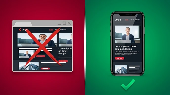
Dragging your browser window narrower approximates a small screen, but it misses details that matter: real devices have notches, rounded corners, and specific pixel dimensions that don’t match an arbitrarily resized window. A layout that looks fine in a resized browser can still look cramped or oddly spaced inside an actual iPhone frame with its notch cutting into the top of the screen.
Checking against real, named device models — not just generic breakpoints — catches these details before an actual visitor does.
How to Use the Responsive Website Checker (Step-by-Step)
Step 1: Enter Your Website URL
Type the URL into the address bar at the top and click Preview. The site loads inside whichever device frame is currently selected.
Step 2: Choose a Brand
Select from Apple, Samsung, Pixel, OnePlus, Moto, Laptops, or Displays in the sidebar to filter the device list to that brand’s models.
Step 3: Search or Browse Specific Models
Use the search box to jump directly to a specific device — for example, typing “15 Pro” filters straight to matching iPhone models — or scroll the full list to browse everything available under the selected brand.
Step 4: Select a Device
Clicking a model loads its exact screen resolution into the frame, automatically scaling the preview to fit your screen while preserving the real proportions.
Step 5: Rotate If Needed
Use the rotate button to flip supported devices between portrait and landscape orientation, useful for checking how your layout handles both.
Step 6: Try a Custom Size
If you need a resolution not covered by the built-in list, enter a custom width and height directly and click Apply to preview that exact size.
What This Tool Actually Includes
- 150+ named device models across Apple, Samsung, Google Pixel, OnePlus, and Motorola, each using real, specific screen resolutions
- Laptop and monitor previews, including ultrawide and large-display resolutions for checking desktop layouts, not just mobile
- Realistic device framing — notches, rounded bezels, and hardware button styling that visually distinguishes phones from laptops and monitors
- Custom size input for any resolution not covered by the preset model list
- Landscape rotation for supported device types
- Dark and light interface modes for comfortable extended use


Honest Limitations Worth Knowing
Being clear about what this tool can and can’t do makes it more useful, not less:
- It won’t load sites that block iframe embedding. Some websites set headers (like X-Frame-Options or a restrictive Content-Security-Policy) specifically to prevent being displayed inside another page’s iframe. If a site refuses to load here, that’s the site’s own security setting, not a bug in this tool.
- It doesn’t spoof the device’s actual user agent. Some websites serve different content specifically based on detecting a real mobile browser’s identity. This tool changes the visual frame size but browses as your regular desktop browser underneath, so server-side mobile detection logic may not trigger the same way it would on an actual device.
- It’s a visual layout check, not a full device simulator. Touch interactions, device-specific performance, and camera or sensor-dependent features aren’t replicated — this tool is built for checking visual layout and responsive behavior, not full functional device testing.
What to Actually Check Once Your Site Loads
- Text readability at each device’s real width, not just whether content technically fits
- Navigation menus — do they collapse into a usable mobile pattern, or overlap awkwardly?
- Images and buttons — do they scale proportionally, or does anything overflow the frame?
- Notch and safe-area conflicts — does any critical content sit under where a device’s notch or camera cutout would be?
- Landscape behavior — many layouts are only ever tested in portrait and break unexpectedly when rotated
Browser Resizing vs. Browser DevTools vs. Real Device Frame Preview
| Factor | Manually Resizing Browser | Browser DevTools Emulation | Real Device Frame Preview |
|---|---|---|---|
| Realistic Device Shape | No | Partial (rectangle only) | Yes, including notches/bezels |
| Named, Specific Models | No | Limited presets | 150+ specific models |
| User Agent Spoofing | No | Yes | No |
| Custom Resolutions | Manual, imprecise | Yes | Yes |
| Visual Context | Low | Moderate | High |
The most thorough workflow combines these — use this tool for a fast, visually accurate layout check across many real device shapes, and use browser DevTools when you specifically need user-agent-based testing.
Common Mistakes When Testing Responsive Layouts
- Only checking one device per brand. An iPhone SE and an iPhone Pro Max have meaningfully different widths — a layout that works on one doesn’t guarantee it works on the other.
- Skipping landscape entirely. Many users do browse in landscape, especially on tablets and larger phones, and layouts tested only in portrait can break unexpectedly.
- Ignoring laptop and monitor previews. Responsive testing isn’t only about mobile — desktop layouts on ultrawide or very large monitors can have their own unique problems, like content stretching too thin.
- Assuming a fitting layout means a good layout. Content technically not overflowing the frame doesn’t mean it’s comfortably readable or well-spaced.
Pro Tips for More Effective Device Testing
- Test the narrowest and widest devices in your target list first. If your layout holds up at both extremes, the models in between are usually fine too.
- Check real content, not placeholder text. Long product names, long navigation labels, or real user-generated content often reveal spacing issues that lorem ipsum text hides.
- Use custom sizes to test edge cases. If you’re curious how your layout handles an unusual width between standard breakpoints, the custom size input is faster than hunting for a matching preset model.
- Revisit this check after any layout change, not just at initial launch — a small CSS tweak can shift how content behaves across device sizes in ways that aren’t obvious from a single desktop view.
- Not sure which screens matter most? Read which devices to test your website on. If you want to try a layout change first, paste it into the Live Code Editor.
Checklist Before Calling a Layout Device-Ready
- Checked at least one small phone, one large phone, and one tablet or fold-style device
- Tested landscape orientation on supported devices
- Checked at least one laptop and one large monitor resolution
- Verified no content sits under a notch or camera cutout area
- Confirmed navigation and buttons remain usable at the smallest tested width
- Re-tested after any significant layout or content change

Frequently Asked Questions (FAQs)
How do I test responsiveness in Chrome?
Open Chrome DevTools (F12 or right-click → Inspect), click the device toolbar icon (or press Ctrl+Shift+M), and pick a preset device or enter a custom width and height. This simulates viewport size well, but it doesn’t replicate real device rendering engines, touch behavior, or hardware performance — which is where a real-device-frame tool like this one adds value on top of DevTools.
Is responsive web design still relevant?
Yes — more so than ever. Mobile traffic now makes up the majority of visits for most websites, and Google uses mobile-first indexing, meaning it primarily evaluates your site’s mobile version for ranking. A non-responsive site risks both poor user experience and lower search visibility.
How do I check if a website is responsive?
The quickest way is to resize your browser window and watch whether the layout adjusts — text reflows, images scale, and the navigation collapses into a menu on narrow widths. For a more realistic check, use a tool like the one above to preview the site inside actual device frames, since browser resizing alone can miss issues that only show up on a real phone’s rendering engine.
Why won't a specific website load inside the device preview?
Some sites set security headers that specifically block being displayed inside another page’s iframe. This is a deliberate setting on the target site, not an issue with the checker itself.
Does this tool show me exactly what a real user would see on their phone?
It shows an accurate visual layout at that device’s real screen resolution, though since it doesn’t spoof the browser’s user agent, sites with server-side mobile detection may behave slightly differently than they would on an actual device.
How many device models does this tool include?
Over 150 named models across Apple, Samsung, Google Pixel, OnePlus, and Motorola, plus a range of laptop and monitor resolutions.
Can I check a resolution that isn't in the preset list?
Yes. The custom size option lets you enter any width and height directly, independent of the named device presets.
Does rotating a device change its actual screen resolution used for preview?
Yes, rotating swaps the width and height values for supported device types, simulating how the layout would appear in landscape orientation.
Is this a replacement for testing on an actual physical device?
For most layout and design checks, yes — it catches the vast majority of responsive issues. For final, pre-launch confidence on a business-critical page, a quick check on an actual physical device is still a reasonable extra step.
Key Takeaways
A responsive layout that “technically fits” in a resized browser window and one that genuinely looks right inside a real device frame are often two different things. Checking against 150+ specific, real device models — including their actual notches, proportions, and orientations — catches layout problems a generic breakpoint check would miss entirely.
Enter your URL above, pick a device, and see exactly what your visitors are really looking at.
Testing your layout across realistic screens is essential for modern web design, but it’s just one piece of building a great user experience. To ensure your design proportions remain precise across all displays, pair your testing with our Aspect Ratio Calculator. Since mobile design and performance go hand-in-hand, don’t forget to evaluate your page load performance using our Website Speed Checker. For more utilities to streamline your workflow, explore our full suite of Developer Tools or head back to Getcalcbase to discover our latest web tools.
Curious which devices actually matter for testing? Our guide on which devices to test your website on covers the real-world screen sizes and browsers your visitors are using in 2026. Once your layout looks right across devices, two more checks are worth running: our Website Speed Checker confirms your pages load fast on mobile connections, and the Image Load Time Calculator helps spot oversized images before they slow down the experience you just tested.
Getcalcbase Disclaimer:
The Responsive Website Checker provided by Getcalcbase is designed for visual layout testing and preview purposes only. While it accurate simulates display dimensions, aspect ratios, and visual device frames (such as notches and bezels), it does not fully simulate physical hardware performance, browser user-agents, or real touch interactions. Some third-party websites may not load within the preview tool if they have iframe embedding restricted via security policies (such as X-Frame-Options or Content-Security-Policy). Getcalcbase is not responsible for external website content or third-party display restrictions.
What the Get Calculator Base Community Says
Average Rating: 4.8/5 based on our beta users