

Keep this important point in mind: today, mobile is the most secure and widely used device, so focusing on mobile responsiveness is the most crucial thing. If your website is not responsive, Google will not like your traffic. If you look at old websites today, their responsiveness is not good. With the way Google’s updates are coming, they are down ranking those sites. To check your responsiveness, click the button below and use the tool.
Most web traffic now comes from phones, and Google mainly uses the mobile version of your page when it decides how to index and rank it. That makes the small-screen version the one that gets judged first, not the one you check at the end. If you want a quick look at how your own page holds up, use the checker button below.

Quick Answer: What Is Mobile-First Design?
Mobile-first design means starting your layout, content, and functionality decisions from the smallest screen size first, then progressively adding complexity as screen space increases — rather than building a full desktop layout and shrinking it down afterward. It forces simpler, more focused design decisions from the very first step. Checking your layout against real device sizes using a responsive website checker shows you exactly how those decisions hold up in practice.
Why Mobile-First Isn’t Just “Test on Mobile Too”
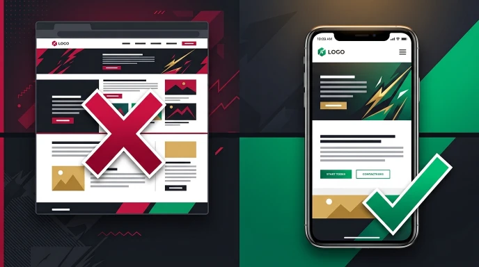
A lot of confusion comes from treating mobile-first as a testing step rather than a design philosophy. Testing your finished desktop design on a phone afterward isn’t mobile-first — it’s desktop-first with a mobile check tacked on at the end, and it usually produces exactly the kind of cramped, over-cluttered mobile experience mobile-first design is meant to prevent.
The real difference is in the order of decisions. Mobile-first means asking “what does this page absolutely need on the smallest screen?” before asking “what else can we add once there’s more room?”
Why This Order Actually Matters
Starting from a small screen forces genuine prioritization. You physically don’t have room for five navigation items, three sidebar widgets, and a large hero image all competing for attention — so you’re forced to decide what actually matters first. Starting from a spacious desktop canvas, that forcing function doesn’t exist, and it’s easy to accumulate elements that all seem reasonable individually but overwhelm a small screen collectively.
There’s also a practical technical benefit: mobile-first CSS, using min-width media queries to add complexity as screen size increases, tends to produce cleaner, more maintainable code than desktop-first CSS that uses max-width queries to strip things away.
Mobile-first design vs. mobile-first indexing. They sound alike but aren’t the same. Mobile-first design is how you build a layout: start with the smallest screen and add complexity as space grows. Mobile-first indexing is how Google crawls: it mainly uses the mobile version of your page for indexing and ranking. A site can be designed desktop-first and still be indexed mobile-first, so the main content and links should match on both versions.
How to Actually Start Designing Mobile-First

Step 1: List Your Content by True Priority
Before opening a design tool, write down every element you’re considering — navigation, hero content, calls to action, secondary links — and rank them by actual importance to the page’s core purpose. Be honest here; everything feels important until you’re forced to choose.
Step 2: Design the Smallest Layout First
Start with your mobile layout using only your highest-priority items. If something doesn’t comfortably fit or clearly earn its place at this size, that’s useful information, not a problem to force past.
Step 3: Identify What to Add as Space Increases
Once your mobile layout feels solid, move to tablet width and ask what additional content or functionality genuinely benefits from the extra space — not what you can now technically fit.
Step 4: Expand to Desktop Last
Desktop is where you have the most room, but resist the urge to fill it just because space exists. Adding extra columns, wider images, or more navigation items should still be a deliberate decision, not a default.
Step 5: Verify Across Real Device Sizes
Once your responsive layout is built, check it against real, specific device models rather than just resizing your browser. A responsive website checker lets you preview your actual layout inside real iPhone, Samsung, and other device frames, catching spacing or notch-related issues a generic breakpoint check might miss.
If you’re unsure which screens to include, read our guide on which devices you should actually test your website on.
Mobile-First vs. Desktop-First: A Practical Comparison
| Factor | Mobile-First Approach | Desktop-First Approach |
|---|---|---|
| Content Prioritization | Forced early, by necessity | Often happens too late |
| CSS Complexity | Generally simpler (min-width queries) | Often messier (max-width overrides) |
| Common Failure Mode | Desktop can feel sparse if not expanded thoughtfully | Mobile often feels cluttered or cramped |
| Best Fit For | Content-heavy or mobile-majority audiences | Highly desktop-specific tools or dashboards |
Neither approach is universally “correct” — but for most public-facing websites, where mobile traffic dominates, starting from the smallest screen produces more disciplined, usable results.
Mobile-First Principles Worth Following
- One primary action per screen. Mobile users respond better to a clear, single next step than to multiple competing calls to action.
- Larger touch targets than you’d use for a mouse. Buttons and links need enough space for a finger to tap accurately, not just enough visual size to read.
- Progressive disclosure over dense information. Collapsing secondary information behind an expandable section keeps the initial view focused, without removing the information entirely.
- Performance as a design constraint, not an afterthought. Every image and script you add to a mobile-first design should justify its cost in load time, not just its visual appeal.
| Check | Guideline |
|---|---|
| Viewport tag | <meta name="viewport" content="width=device-width, initial-scale=1"> |
| Tap targets | Tap Targets: According to WCAG 2.2 AA, the minimum size should be 24×24 CSS pixels, while a comfortable size is considered to be 44–48 px. |
| Form inputs | Set the font size to at least 16px to prevent iOS Safari from automatically zooming in when the input is focused. |
Where Image and Performance Decisions Fit In
Mobile-first design and mobile performance are closely connected — a beautifully prioritized layout still frustrates users if it loads slowly on a mobile connection. Images are consistently one of the biggest factors here; checking how much your visuals contribute to load time using an image load time calculator helps you make informed sizing decisions rather than uploading full-resolution images and hoping for the best.
Once your layout and images are in place, running a full check with a website speed checker confirms whether your mobile-first design choices are actually translating into genuinely fast mobile performance, not just a visually simplified layout.
For formats and compression in more depth, see our image optimization guide.
Common Mistakes When Attempting Mobile-First Design
- Designing desktop first, then calling the mobile version “mobile-first” retroactively. The order of decisions matters, not just the final result.
- Treating mobile-first as only a layout concern. Content length, image sizing, and performance all need the same mobile-first prioritization as visual layout.
- Assuming mobile-first means “stripped down and boring.” Mobile-first means prioritized and intentional — it doesn’t mean removing personality or visual interest, just being deliberate about what earns space.
- Never testing on real device shapes. A layout that looks reasonable in a resized browser can still have real problems once tested against an actual notch or specific screen proportion.
Pro Tips for Effective Mobile-First Design
- Write your content before designing the layout. Knowing your actual content length and complexity prevents designing a shell that your real content doesn’t comfortably fit.
- Test with real content, not placeholder text, since actual headlines, product names, or user content often reveal spacing issues generic filler text hides.
- Revisit your priority list periodically. What mattered most when a page launched can shift over time as a business or audience changes.
- Check multiple real device sizes, not just one. A layout that works on a mid-size phone doesn’t guarantee it works equally well on both the smallest and largest common screens.
Checklist for a Genuine Mobile-First Approach
- Content prioritized by importance before any layout design began
- Mobile layout designed and finalized before expanding to tablet or desktop
- Each addition at larger screen sizes deliberately chosen, not just filling space
- Touch targets sized appropriately for fingers, not just visually
- Images checked for load time impact, not just visual quality
- Layout verified against real device frames, not just a resized browser window
Frequently Asked Questions
Is mobile-first design the same as responsive design? They’re related but not identical. Responsive design refers to a layout adapting across screen sizes; mobile-first is a specific approach to building that responsive layout, starting from the smallest screen first.
Does mobile-first design mean my desktop site will look empty? Not if done well. Mobile-first means deliberately adding content and complexity as space increases, so a well-executed desktop layout should still feel complete, just thoughtfully built rather than automatically filled.
Why is mobile-first CSS considered cleaner than desktop-first CSS? Mobile-first typically uses min-width media queries to progressively add styling, which tends to produce fewer overrides than max-width queries that strip styling away from a complex desktop-first base.
Do I need to abandon my existing desktop-first site to benefit from mobile-first principles? Not necessarily a full rebuild — auditing your mobile experience specifically and applying mobile-first prioritization principles to future updates can meaningfully improve things without starting over.
How do I know if my mobile-first design is actually working? Beyond visual review, checking load speed, verifying layouts against real device frames, and confirming touch targets are appropriately sized are concrete ways to validate the result, not just assume it.
Is mobile-first design necessary for every type of website? It’s most valuable for content-heavy or mobile-majority-traffic sites. Highly specialized desktop tools or dashboards may reasonably prioritize desktop first instead.
Is mobile-first design the same as mobile-first indexing?
No. Mobile-first design is a way of building layouts, starting from the smallest screen and adding complexity as space grows. Mobile-first indexing is how Google crawls, using the mobile version of your page for indexing and ranking. They work well together, but a site can be built either way and still be indexed mobile-first, so the main content and links should match on mobile and desktop.
Key Takeaways
Mobile-first design isn’t a testing checkbox — it’s a decision-making order that forces genuine prioritization from the very first design choice. Starting small, being deliberate about what earns space as screens grow, and verifying the result against real device shapes produces meaningfully better results than designing for desktop and shrinking down afterward.
Build your next layout mobile-first, then verify it against real devices using the responsive website checker before calling it finished.
Explore more free tools at GetCalcBase:
Prepared by Waseem Aijaz — WordPress Developer & SEO Expert. Connect on LinkedIn